Showing posts with label Paper-Source. Show all posts

Monday, September 20, 2010

Craft Room Coming Along...

So my tiny little house just got bigger!  Ever since I moved into my little 900 square foot house I have basically used the second bedroom as a large storage closet.  When I moved in I never fully unpacked all of my crafts (I have sooooo much from years of working at Paper-Source!) since I didn't really have a proper storage solution for them.  I had no desk and no real craft storage area...so all of the crafts just sadly sat in boxes waiting patiently for me to get my act together.  Some of my crafts were stored in the "back room" (but mostly they are in boxes in the garage) but really I just use the room to sort my dirty laundry and as a place to house the kitties' litter box.  Up until this weekend that is!

I took a trip to Ikea, and just shy of $1000.00 later, I now how a fully functioning craft room!  I will be showing a full reveal here soon, but I haven't got all of my crafts organized and into the room yet...so I will just show you a couple of "in progress" shots.

Here are just some of the boxes I had to put together...and my fingers are still sore from tightening down all of the little nuts...

And here is the desk I had in the room before.  In this picture it looks like it was probably usable...but it really wasn't because of all of the laundry that was usually in there...


And check out all of those wires!!!  It is amazing how many wires are connected to my damn computer!  Anyways, here is the corner truly "in progress."  Most of the crafts are organized and the shelves are up...


And that pile of sh*t is actually much higher and deeper than it looks!


Well hopefully in the next couple of days I can get the full reveal up.  And thankfully TOMORROW IS MY LAST DAY of the 21 day detox cleanse I have been on!  I can't wait to eat food again!  Yippie!!!

Thursday, July 22, 2010

My Kitchen...Now New And Improved!!!

So if you have seen my blog before, you have probably seen the some of updates that have been made to my kitchen.  But in case this is your first perusal...here is the wall above my stove.


Isn't that hole lovely??? When I moved in there was a 4 inch metal tube going from my oven to my wall.  Its purpose appeared to be for venting...but it wasn't actually hooked up to anything so it was just there for "decoration" I guess...so I riped it down first thing.  And now I get to stare at this while I am cooking...appealing right?

It also left a hole at the top of my stove which I have not cleverly hidden with a cupcake shaped trivet.


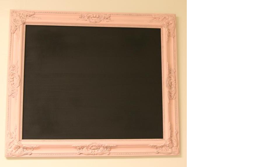
So I knew I needed some artwork for my kitchen so I landed on adding a large chalkboard (for more on that click here) and some prints.  I saw this post on Stephanie's blog Under The Table And Dreaming.  I really loved the vintagey feeling of these signs and loved the "if you can't take the heat" message!  Too cute!


So I printed two of them out that I thought would look cute with the chalkboard.  And since the chalkboard was in a very ornate traditional styling, I thought I should choose frames for the other two prints that had that same feeling.  Here is a quick before-and-after of the chalkboard redo:


I picked up this frame awhile back at Marshall's for $8 bucks.  I originally picked it up for my Dad (sorry Dad) to use to frame one of his many family western pictures, but the shape is just too cute and so I kept it.


It got a couple of quick coats of ballet slipper pink spray paint and it already looked distressed. 


Which inspired my to attempt glazing on the other two frames (more of that story click here)


And since I like this frame the best, I choose to put the print in it I like the best.  But what should I back it with to make it pop?


I really like the Japanese papers from Paper-Source so I thought I would start there.  and this classic cherry blossom print was very pretty...but I felt it was just a little too busy and not really the vibe I was going for.  so I tried out this one...


Again cute...but just not right.  The saying is "tough" so I needed a paper pattern to match it.


Now this was closer to what I was going for...but still not just right.  I felt it was too busy...so maybe a solid would look better...


Now I liked this the best!  But it just looks too flat...too one dimensional.  So maybe if I blew the print up larger?


OK I like this, but still too plain (I am a very picky woman...haha)


Then I remembered I had some leftover paper from some invitations I had done that had a great print.  So I grabbed the extras from my craft room...


I like that...but the print kind of gets lost because it it so light...


And this was good.  But it was still lacking something...so maybe a combination of solids with a print...


And tada!  Perfection!  Now for the next frame.  I started using this cheapo frame that was part of a grab bag of frames I got from Craigslist for $25.00 awhile back, but it just didn't fit with the other two...


See what I mean?  The top one is too plain.  so I remembered that I recently acquired a few other frames from the thrift store (again purchased for my Dad and once again I kept them...sorry Dad).  And these have a much better shape to them.


So a couple coats of spray paint later...


So here is the final product hung up in my kitchen!


Pretty cute huh???  It is a big improvement!  This is much better to walk in to...


And the two framed prints look pretty good together...


So here is the final before and after shots...enjoy!


Friday, July 16, 2010

So One More Post About Artwork For My Very Bare Walls!

While perusing Blogger-land last week I came across this inspirational picture on a post (forgive me…I don’t remember whose blog it was).


And I loved it! Not only for its very sweet message, but also because I need artwork for my walls and it matches the color of my living room. And I just happen to have this bare wall that is crying out for something to be hung on it (not unlike the rest of my walls!)


I also had a frame from the $25.00 craigslist frames that isn’t a standard size – it appears to be 8x11 ½. So I printed this off on the color laser printer I have at my desk at work, and brought it home. The size looked a little off, so I trimmed the edges of the print and backed it with some Italian Bertini paper I had lying around from Paper-Source. This made it look much better.


I know it is strange (or just plain lazy) to back my paper directly onto the backing of the frame, but in this case it worked out just fine.


Now for the frame itself, I didn’t want to leave it the awful Gold color that it was, so I decided to spray paint it using two different finishes. Both are from the Rust-Oleum line of Universals, and I went with the Metallic Silver and Brown Hammered cans.


The way I achieved the effect I was going for was to spray two coats of the silver spray paint directly onto the frame (no primer) and with only about 30 second in between the coats. It’s ok if the coats are a little thick and it is ok if the spray paint runs a little. As soon as I was done applying the silver, I immediately applied two coats of the Hammered spray paint on the still wet silver paint. This mixes the paint colors together, and since the hammered paint settles on the frame in a weird way anyways, once again drips don’t matter. I then gave the frame a good 4-5 minutes to dry a little before I applied one more thick coat of the brown hammered paint and then let it dry overnight. This gives it that sort of marbled looking finish.


I really like this finish and I did it on a couple of the frames for another project I will be completing soon (the rest of the $25.00 frame lot from craigslist). I realize that it is not for everybody, but I like that it is slightly different from the simple “flat” finish that you usually get with spray painting something.


I even really like it on this dresser/sideboard in my living room (the picture is very deceiving as the colors appear to clash here, but in person they match and complement each other beautifully), but my bare walls need it more than the sideboard does. What do you think?


And I am sorry for the poor quality of some of the photos. My 3G iPhone just doesn’t take very good pictures…so I guess it is time to upgrade to the iPhone 4. It seems like it just might be a necessity!!!


Once again, it was really great to go from this:


To This!!!


linking with: